2026年4月24日
In
BRANDING
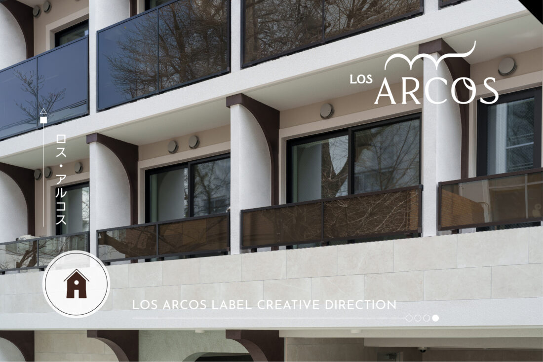
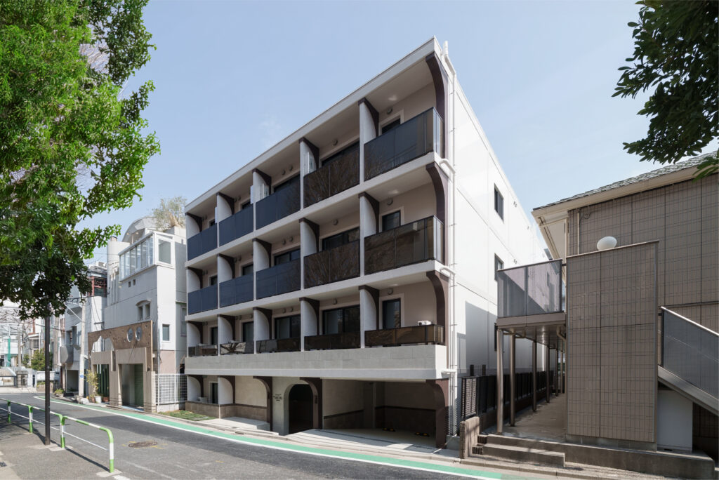
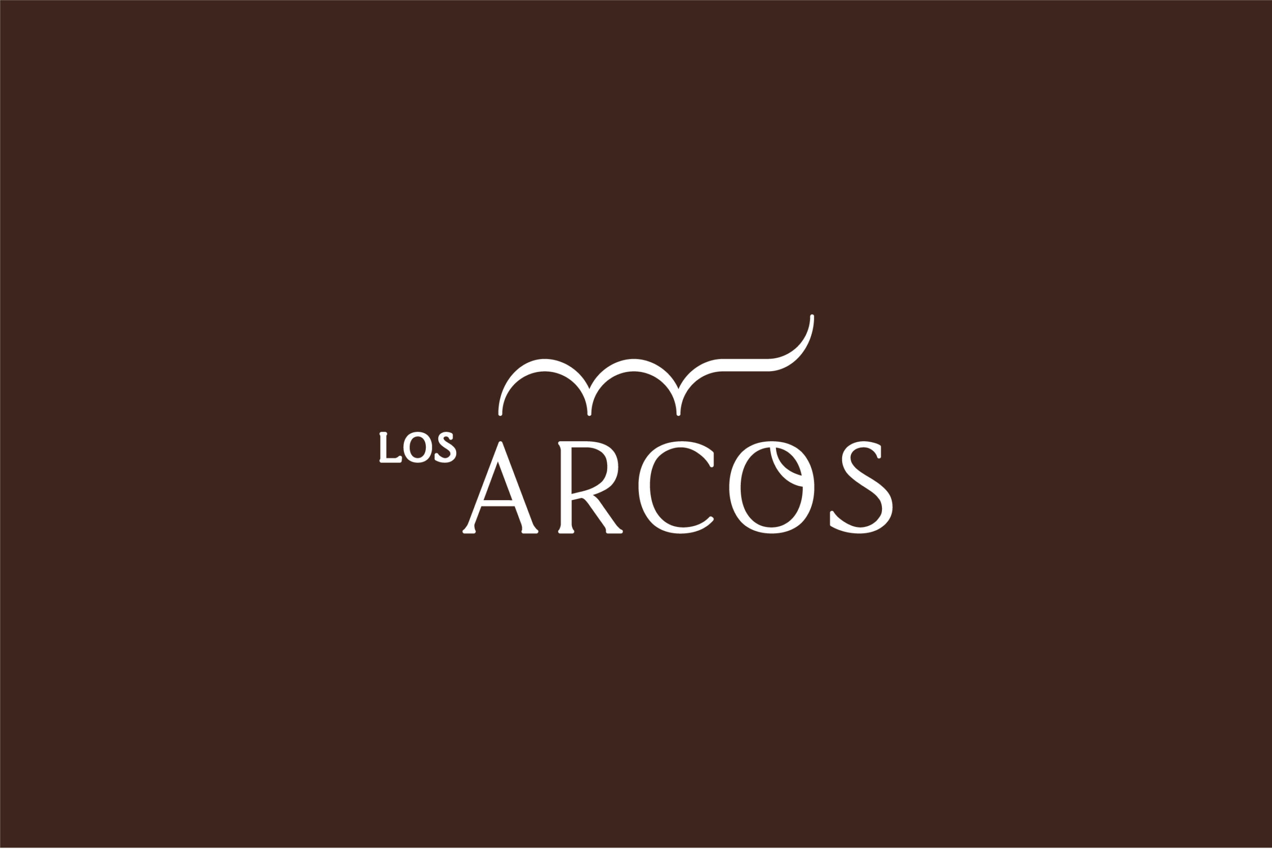
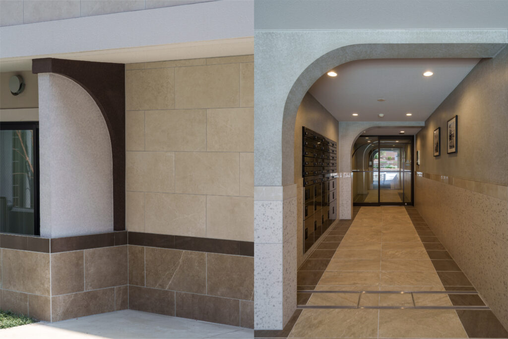
LOS ARCOS HOUSING LABEL BRAND DIRECTION


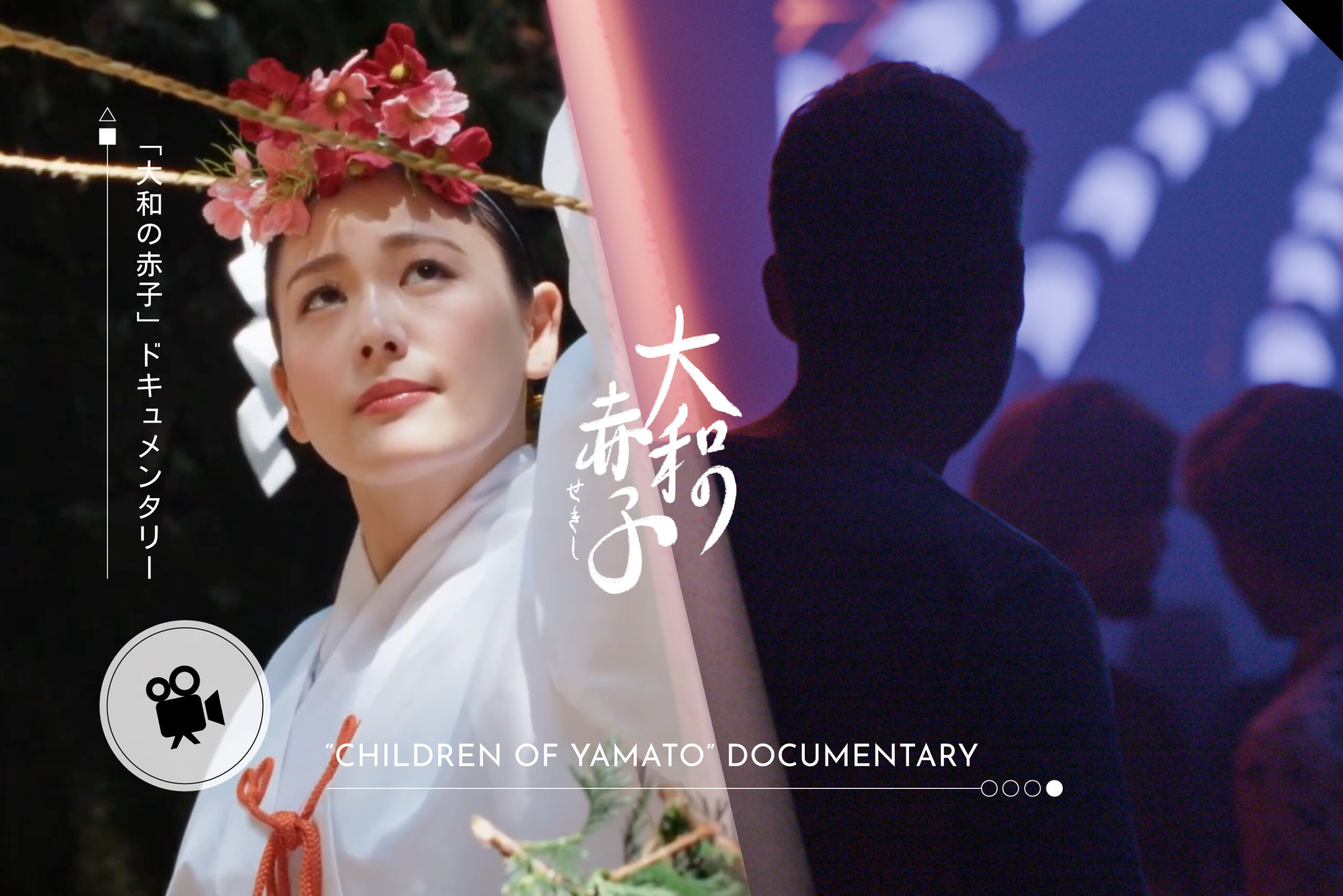
“CHILDREN OF YAMATO” DOCUMENTARY VISUAL DESIGN
ドキュメンダリーのビジュアルデザイン & ポスターデザイン...
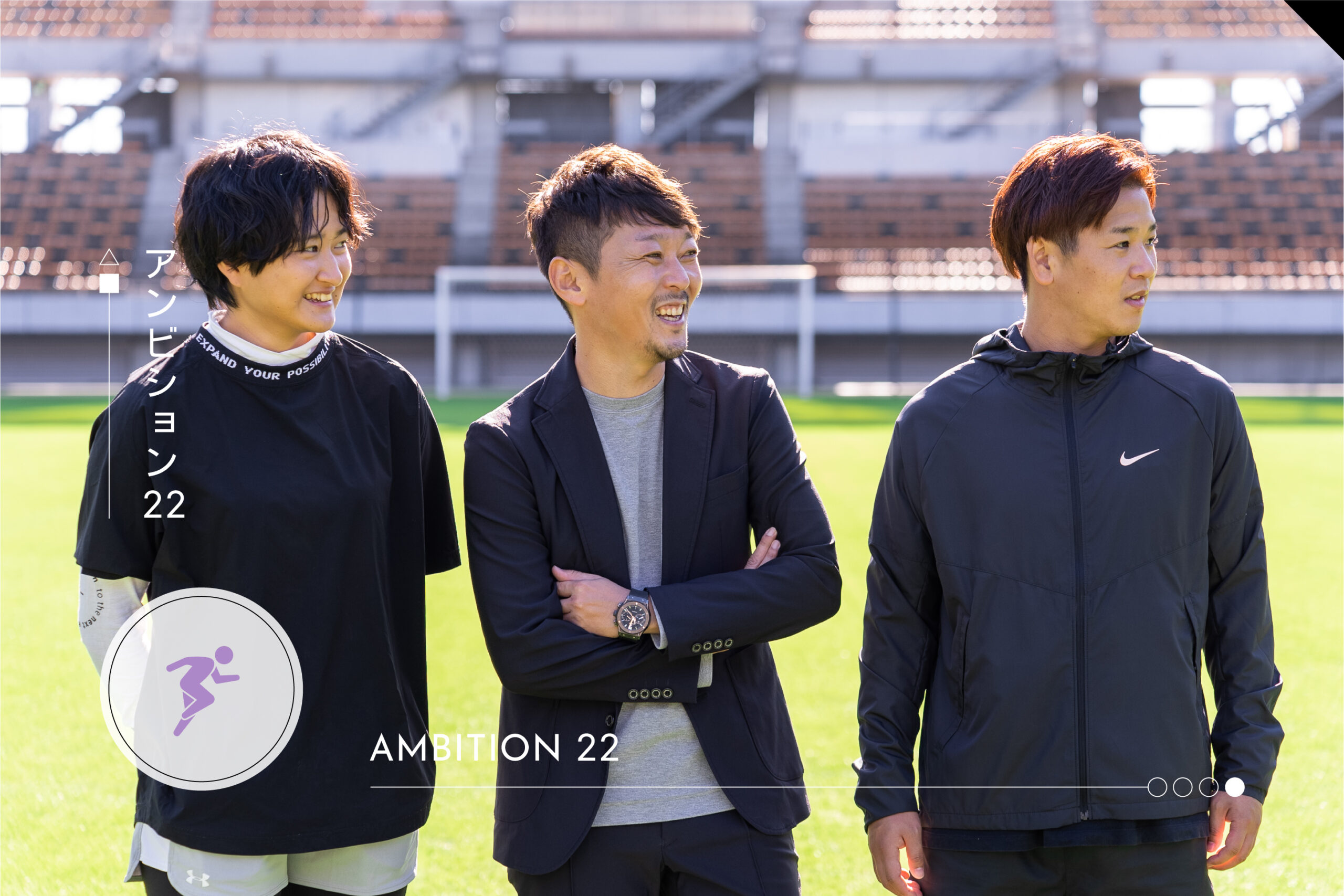
AMBITION22
企業成長に向けた会社のトータルブランディング...