EIKO FOOD PRODUCTS BRANDING & WEBSITE RENEWAL

概要
北海道を拠点に水産加工品を製造してきた栄興食品有限会社は、丸一大西食品株式会社のグループ会社としてその歩みをスタートさせました。創業からの信頼と実績を礎に、年々事業規模を拡大し、今ではグループ内の売上に占める割合も約5%にまで拡大。さらなる飛躍を見据えて、新工場の設立とともに、独自のブランディングとWEBサイト制作を進める運びとなりました。
背景と課題
これまで独自の対外的発信が少なかった同社では、企業認知度の向上、採用強化、そして取引先との新たな接点創出が大きな課題となっていました。また、社内外問わず一貫したブランドイメージを伝えるための整備も求められていました。

提供したソリューション
株式会社INTERPLAYは、栄興食品の強みを深掘りし、「鮮度に拘るなら栄興食品」というブランドの軸を打ち立てました。70年以上の歴史と信頼をビジュアルで表現しつつ、現代的な温かみを加えたデザイン設計を行い、以下の施策を実施しました。
● ブランドガイドライン策定
「原料の直接仕入」「鮮度を維持する技術」「柔軟な対応力」の3つのキーワードをもとに、デザインやコピーの統一ルールを策定。
● ロゴデザイン
既存の印象を踏襲しつつ、新たなブランドイメージと親和性のある刷新を実現。北海道と水産加工、地域との繋がりをイメージし、一つのアイコンをデザイン。
● UI/UX設計
訪問者が求める情報へ直感的にアクセスできる構成と導線設計を徹底。
● ビジュアル制作
誠実さと信頼感、親しみやすさを兼ね備えたトーンでデザインを構築。
● 情報設計
新規取引先の目線に立ち、商品や設備、工場の衛生管理など信頼に関わる情報を丁寧に整理。

成果と展望
WEBサイト公開後は、お問い合わせ件数の増加や採用における母集団形成への貢献が期待されています。また、社内でブランドの言語化が進んだことにより、社員一人ひとりが自社の価値を自信をもって語れるようになったことも、プロジェクトの重要な成果のひとつです。
今後は、新工場稼働と連動しながら、より一層栄興食品の強みを発信していくための運用体制整備や、販促ツールへの展開も予定しています。

Eiko Foods Co., Ltd.—a long-established local seafood processing company based in Hokkaido—has steadily expanded its operations over the years. With the launch of a new factory, we got the chance to work on its brand development and a new website to support its future growth.
Our mission was to create a cohesive brand identity that resonates both internally and externally, highlighting the company’s strengths and long-standing reputation while introducing a fresh, modern perspective.
Background and Challenges
Until now, the company had limited external communication under its own name, making increasing brand awareness, strengthening recruitment efforts, and creating new points of contact with business partners major challenges. Additionally, there was a need to establish a consistent brand image both internally and externally.
Our Solution
We took a deep dive into Eiko Foods’ strengths and established the brand concept: “If you care about freshness, choose Eiko Foods.” While visually conveying the company’s 70-year history and trustworthiness, we added a modern warmth to the design and implemented the following strategies:
● Brand Guidelines Development
We formulated unified design and copywriting rules based on three key phrases — “Direct sourcing of raw materials,” “Technology to maintain freshness,” and “Flexible responsiveness.”
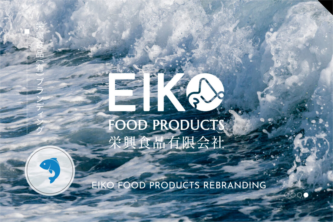
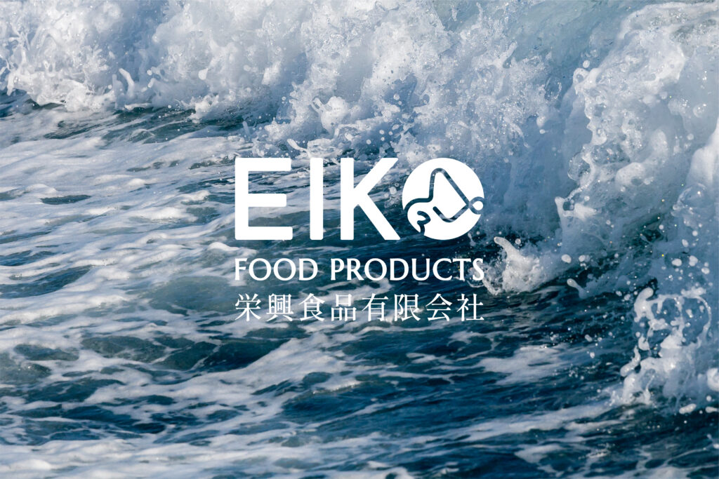
● Logo Design
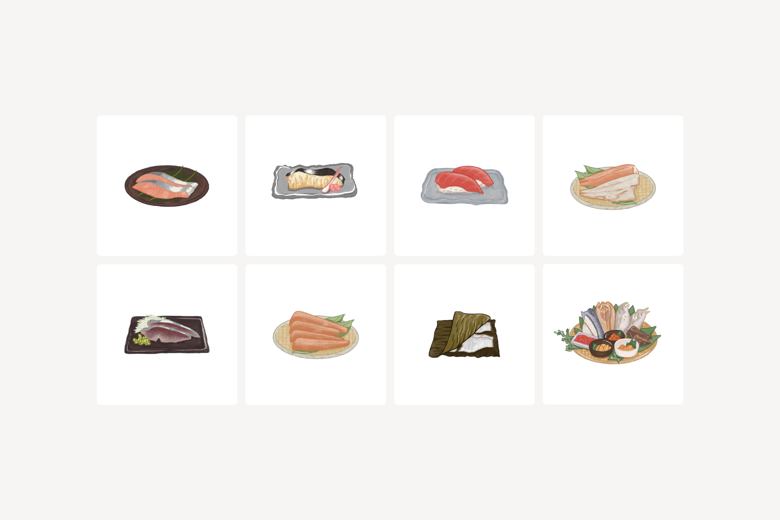
While retaining the essence of the original logo, we refreshed it to align with the new brand image. The design includes an icon that evokes Hokkaido, seafood processing, and the company’s ties to the region.
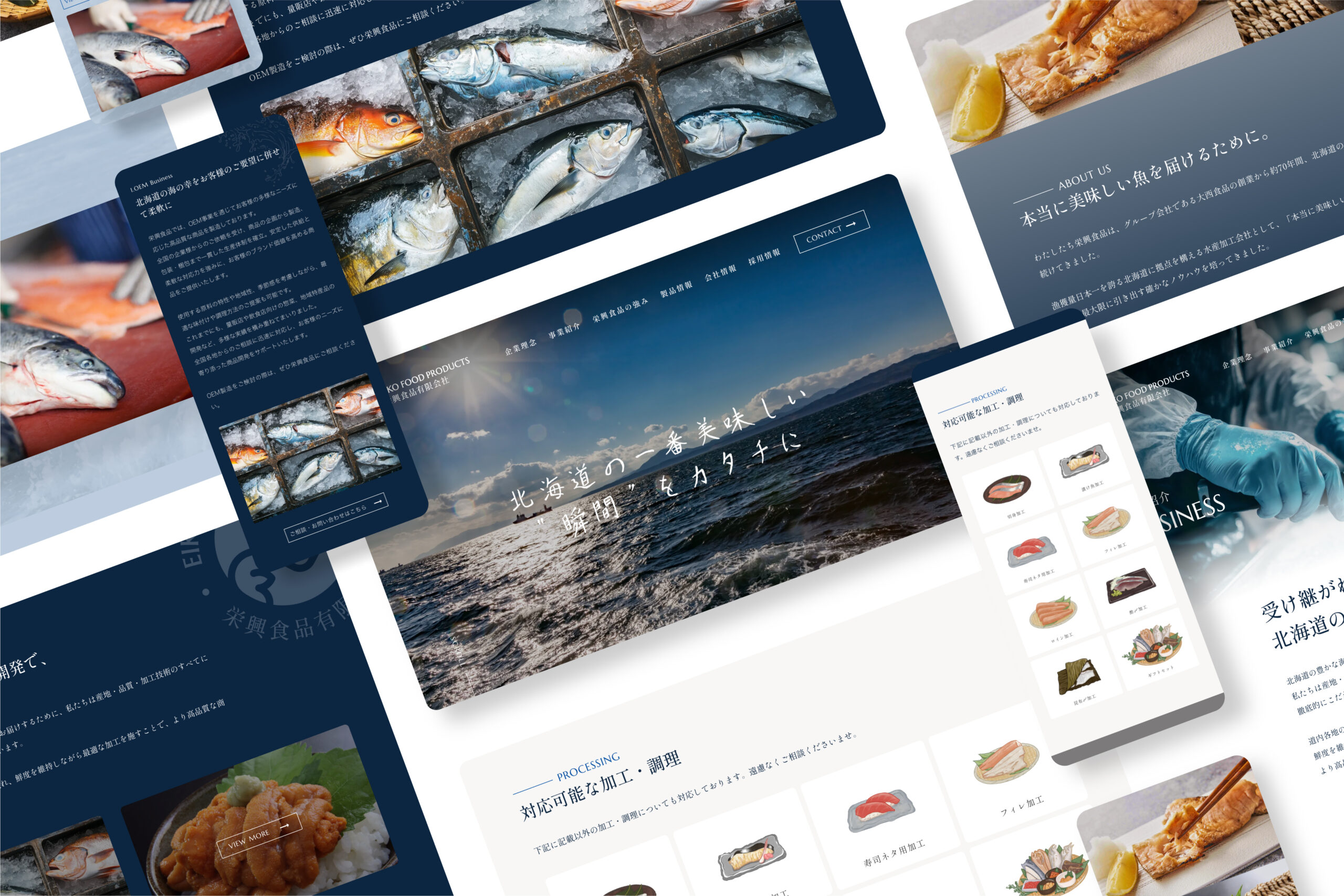
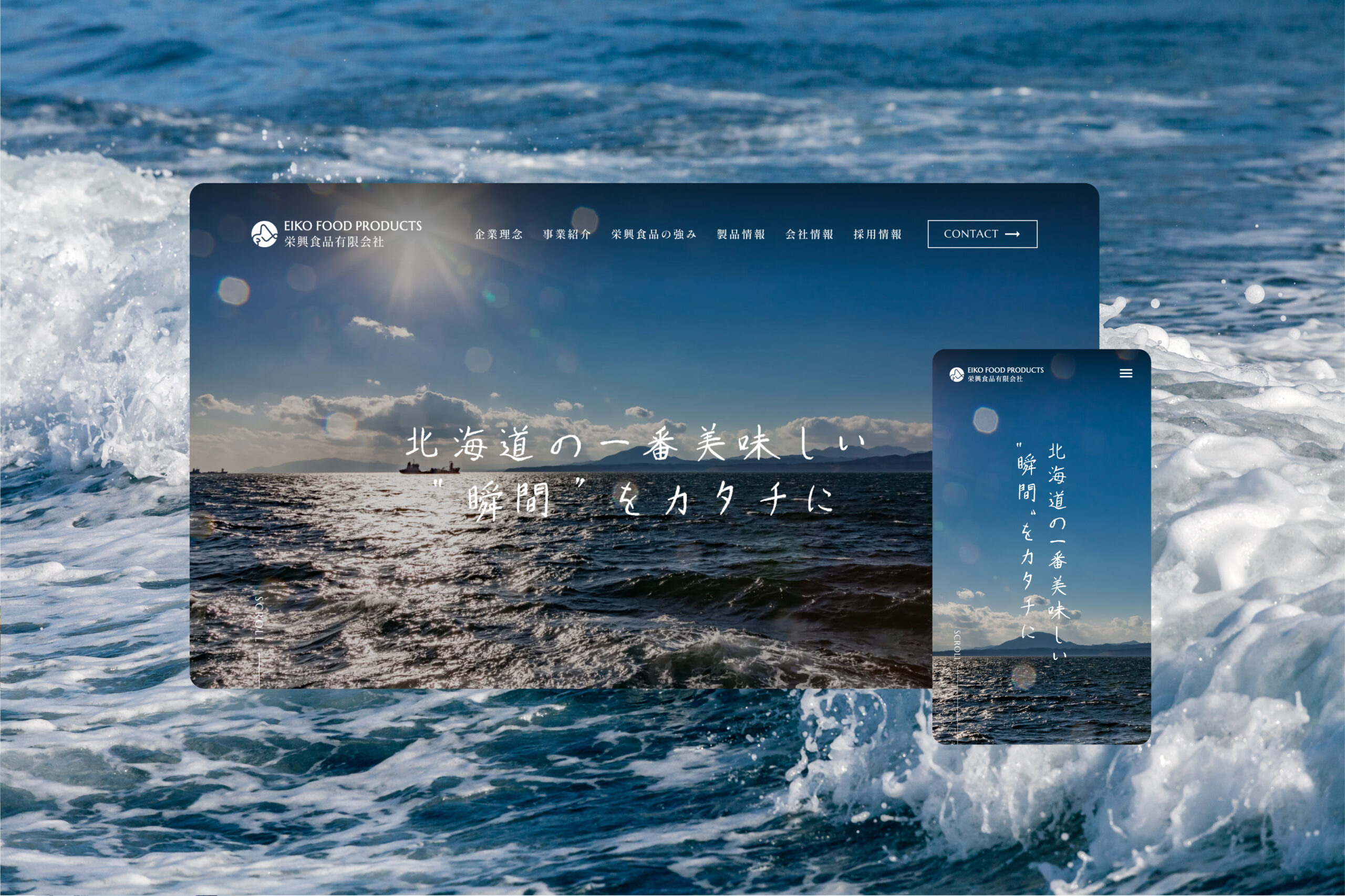
● UI/UX Design
We focused on intuitive navigation and structure, enabling visitors to easily access the information they seek.
● Information Architecture
From the perspective of potential business partners, we carefully organized information related to products, facilities, and factory hygiene — all crucial for building trust.
● Visual Design
We created a design tone that conveys sincerity, reliability, and approachability.
● Real-time Collaboration Using Figma
We established a workflow that allows for seamless, lag-free sharing and updates, even when working remotely.
Results and Future Outlook
Following the website launch, an increase in inquiries and enhanced recruitment efforts through a stronger applicant pool are expected. Additionally, the internal articulation of the brand has progressed, enabling each employee to confidently express the value of the company — a key achievement of the project.
Looking ahead, as the new factory comes online, plans are in place to further strengthen brand communication, build an operational framework, and develop promotional tools that showcase Eiko Foods’ unique strengths.
取り組み内容
・ブランディング
・ロゴデザイン
・WEB/ECサイト制作
・グラフィックデザイン
・イラストレーション

渡邊 進太郎
プロジェクトディレクター

鎌倉 彬
クリエイティブディレクター/デザイナー
OTHER PROJECTS
“CHILDREN OF YAMATO” DOCUMENTARY VISUAL DESIGN
ドキュメンダリーのビジュアルデザイン & ポスターデザイン...
AMBITION22
企業成長に向けた会社のトータルブランディング...